Design
How to create a brand identity: a step-by-step guide
A practical, step-by-step process for building a brand identity that looks professional, fits your audience and stays consistent as you grow.
Rapid Action Team · · 9 min read
Key takeaways
- A brand identity is the set of visual and verbal tools that shape how people recognise and remember your business.
- Strategy comes before design: audience, positioning and personality should guide every visual decision.
- A logo is only one part of the identity; colour, typography, imagery and tone of voice matter just as much.
- Simple brand guidelines are what keep an identity consistent once other people start using it.
- Test your identity in real situations, such as a website header, an invoice and a social post, before finalising it.
A strong brand identity makes a small business look established, helps people remember you and makes every piece of marketing easier to produce. A weak or inconsistent one does the opposite, even if your service is excellent.
The good news is that building a brand identity follows a fairly predictable process. This guide walks through it step by step, from the thinking that should come first to the guidelines that keep everything consistent afterwards. Whether you do it yourself or work with a designer, knowing the steps helps you make better decisions.
What is a brand identity?
Your brand identity is the collection of elements you deliberately create so that people recognise your business and understand what it stands for. It typically includes:
- Visual elements: logo, colour palette, typography, imagery style, icons, patterns and layout.
- Verbal elements: name, tagline, tone of voice and key messages.
- Rules: guidelines that explain how all of the above should be used.
Brand, brand identity and brand image
These terms get blurred, so it helps to separate them:
| Term | What it means | Who controls it |
|---|---|---|
| Brand | The overall reputation and feeling people associate with your business | Shaped by everything you do |
| Brand identity | The visual and verbal tools you create to express the brand | You |
| Brand image | How people actually perceive you | Your audience |
The point of a brand identity is to narrow the gap between how you want to be seen and how you are seen. Design alone cannot do that if the service does not match, but it can make sure your best qualities come across clearly.
Step 1: Lay the foundations
The first step is thinking, not designing. It covers why the business exists, who it serves and what the competition looks like.
Define your purpose and values
Before thinking about colours or logos, write down the basics. Keep it short and honest:
- What do you do, and for whom? One sentence, no jargon.
- Why does the business exist beyond making money? What problem are you genuinely trying to solve?
- What do you value? Pick three to five principles you actually act on, such as "straight answers" or "work that lasts".
- What do you never want to be? Sometimes the opposite is easier to define: not corporate, not cheap, not flashy.
These answers become the brief that every later decision is checked against.
Understand who you are talking to
Identify your two or three most valuable customer types. For each, note what they care about, what worries them when choosing a supplier, where they come across businesses like yours, and what would make them trust you quickly. Talking to a handful of existing customers is often more useful than any survey.
Audit the competition
Collect screenshots of the websites, logos and social profiles of five to ten competitors. Lay them side by side and look for patterns:
- Which colours dominate your sector?
- Do most competitors look formal or friendly, premium or budget?
- What claims does everyone make?
This is not about copying. It shows you the visual "default" of your market so you can decide where to fit in and where to stand apart. If every accountant in your area uses navy blue, a different colour could help you be remembered, as long as it still signals trust.
Step 2: Define your positioning and personality
Positioning
Positioning is the specific space you want to own in customers' minds. A simple template:
For [audience] who need [problem solved], we are the [category] that [main difference], because [reason to believe].
Fill it in plainly. If your "main difference" could be claimed by any competitor, such as "great service", keep digging.
Personality
Describe the brand as if it were a person, using three to five adjectives. Then add what each one does not mean. For example:
- Confident, but not arrogant.
- Approachable, but not casual about quality.
- Precise, but not cold.
These pairs are surprisingly useful. They help designers choose between options and help writers find the right tone.
Step 3: Build the visual identity
With the strategy in place, the visual work has a clear direction. Most designers start with mood boards: collections of colours, type, photography and textures that capture two or three possible directions. Choosing between mood boards is much cheaper than choosing between finished logos.
Logo
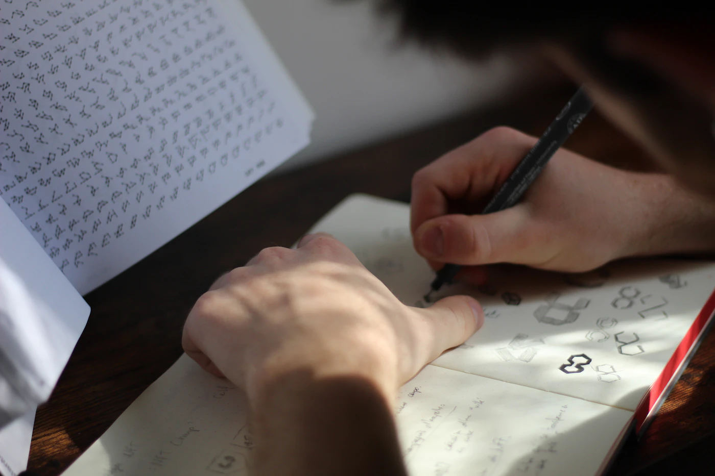
Your logo should be simple enough to recognise at small sizes, distinctive within your sector and appropriate to your personality. Most identities need more than one version:
- A primary logo for most uses.
- A secondary or stacked version for tight or square spaces.
- A symbol or monogram for favicons and social profile pictures.
- Single-colour versions for dark backgrounds and print.
Before committing to a name or logo, it is sensible to check the UK trade mark register for similar marks in your sector.
Colour palette
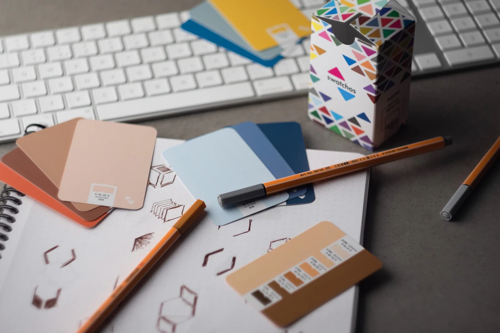
Choose one or two main brand colours, a few supporting colours and a set of neutrals for text and backgrounds. Define each colour in the formats you will need: HEX and RGB for screens, CMYK for print, and Pantone if you plan specialist printing. Check that your text and background combinations have enough contrast to stay readable.
Typography
Two typefaces are usually enough: one for headings with some character, and one for body text that is easy to read at small sizes. Make sure the fonts are licensed for web and print use, and that they include the weights and characters you need.
Imagery, icons and graphic elements
Decide on a photography style (bright and natural, moody, documentary, studio), an illustration or icon style if you use them, and any recurring shapes or patterns. These secondary elements often do more to make a brand recognisable than the logo, because they appear everywhere.
Step 4: Develop your verbal identity
How you sound matters as much as how you look. Your verbal identity should flow directly from the personality you defined in step 2.
- Tone of voice: Write a few short rules, such as "use everyday words" or "lead with the answer". Include before-and-after examples.
- Tagline: Optional, but useful if it clarifies what you do rather than repeating a vague slogan.
- Key messages: Three or four points you want every customer to understand, written in plain language.
- Brand story: A short paragraph explaining why the business exists and who it helps, suitable for an About page or pitch.
Tone can flex between channels. A social post can be lighter than a proposal, but both should sound like the same business.
Step 5: Test it in the real world
An identity that looks lovely on a presentation slide can struggle in daily use. Before finalising, mock up the identity in the places customers will actually see it:
- Your website header and homepage hero on desktop and mobile.
- A social media post and profile picture.
- An email signature and a quote or invoice.
- Signage, a vehicle or uniform if relevant.
- The logo at very small sizes, such as a browser tab.
Show the mock-ups to a few customers or trusted contacts and ask what kind of business they think it is. If their answers match your positioning, you are on the right track.
Step 6: Create guidelines and roll out
The final step turns your designs into something other people can use correctly, then puts it to work.
Write your brand guidelines
Brand guidelines are the instruction manual for your identity. Without them, consistency fades as soon as a new staff member, printer or freelancer gets involved. They do not need to be a 60-page document. For most small businesses, a clear 10 to 20 page guide or a single web page is enough.
| Section | What to include |
|---|---|
| Brand foundations | Purpose, values, positioning and personality |
| Logo | Versions, minimum sizes, clear space and examples of misuse |
| Colour | Values for screen and print, and how often to use each |
| Typography | Fonts, sizes and hierarchy for headings and body text |
| Imagery | Photography and illustration style with examples |
| Tone of voice | Writing principles with dos and don'ts |
| Templates | Social posts, presentations, letterheads, email signatures |
Store the guidelines and all logo files somewhere everyone can find them, with clearly named folders for print and digital versions.
Roll it out consistently
Launch the new identity across your most visible touchpoints first: website, social profiles, email signatures and Google Business Profile. Then work through printed materials, templates and signage as they are due for replacement.
Afterwards, review the identity once a year. Check whether the brand is being applied correctly and whether it still fits the business. Small refinements over time are healthier than a full rebrand every few years.
DIY or work with a designer?
Doing it yourself can work if you are just testing an idea and budget is tight. Templates and online tools can produce something serviceable. The risk is ending up with a generic look that resembles many other businesses, or a logo that does not scale well.
Working with a professional makes sense when you are investing in the business for the long term, entering a competitive market or preparing to scale. A good designer brings the strategy steps above, a wider set of ideas and properly prepared files. Our brand identity design service follows this same process, from discovery to guidelines.
FAQs
How long does it take to create a brand identity?
For a small business, a focused brand identity project typically takes several weeks, depending on how much strategy work is needed, how many concepts are explored and how quickly decisions are made.
What are the core elements of a brand identity?
The core elements are a logo, colour palette, typography, imagery style and tone of voice, supported by brand guidelines that explain how to use them together.
Is a logo the same as a brand identity?
No. A logo is one element of a brand identity. The identity also covers colours, fonts, imagery, language and the rules that bring them together.
Can I create a brand identity on a small budget?
Yes, if you prioritise. Spend your effort on clear positioning, a simple logo, a limited colour palette and two fonts, and apply them consistently. Consistency matters more than complexity.
When should a business rebrand?
Consider it when your current identity no longer reflects what you do, who you serve or the quality you deliver, or when it is causing confusion with competitors. Many businesses only need a refresh rather than a full rebrand.
If you are starting a new business or your current branding no longer fits, book a call and we can talk through where to begin.